The "Ledynas Eau de Perfume" was the second part of my final exam. This project focuses on the way the visual identity of the perfume interacts with it's scent.

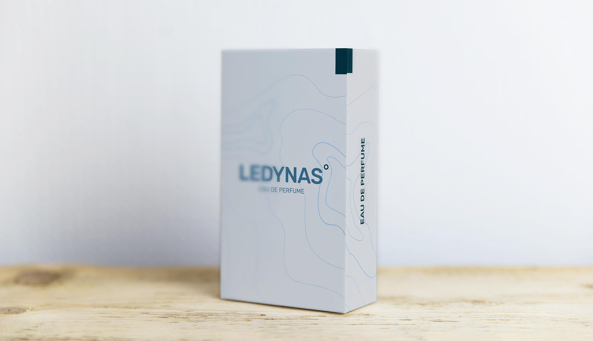
The design concept i chose for this perfume was based on a nautic theme. That is why i chose cold colors like blue tones or petrol. Design Elements like the coordinate dot or the map visualization in the background round up the corporate design of this perfume.

The idea behind the logo was to combine different elements and feelings from the nautic theme and it's atmosphere. The dot symbolizes coordinates, the font should remind one of the typical displays, found on boats.
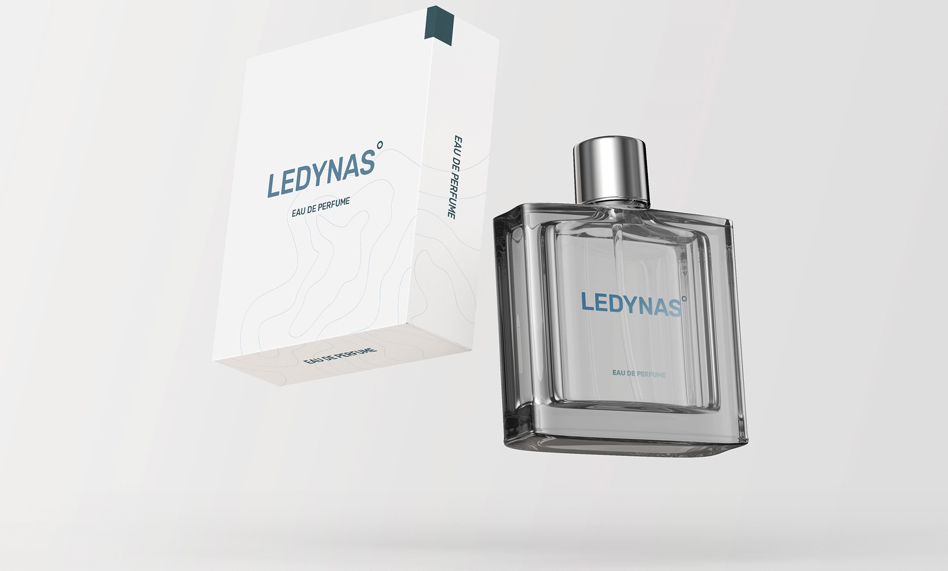
The packaging of this perfume is really basic. Design elements like the map and the dot supports the packaging to give it sort of a more noble feeling to it.


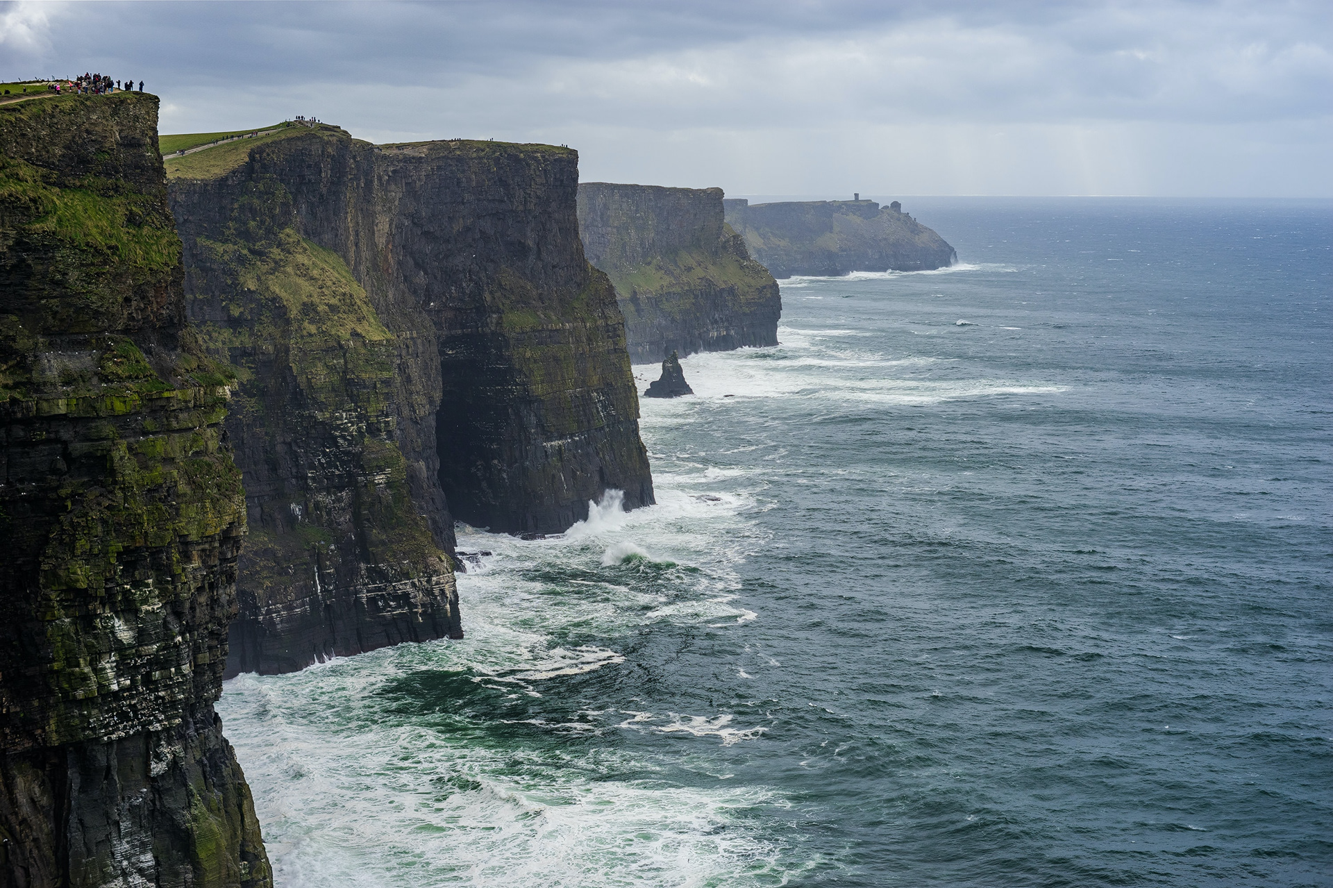
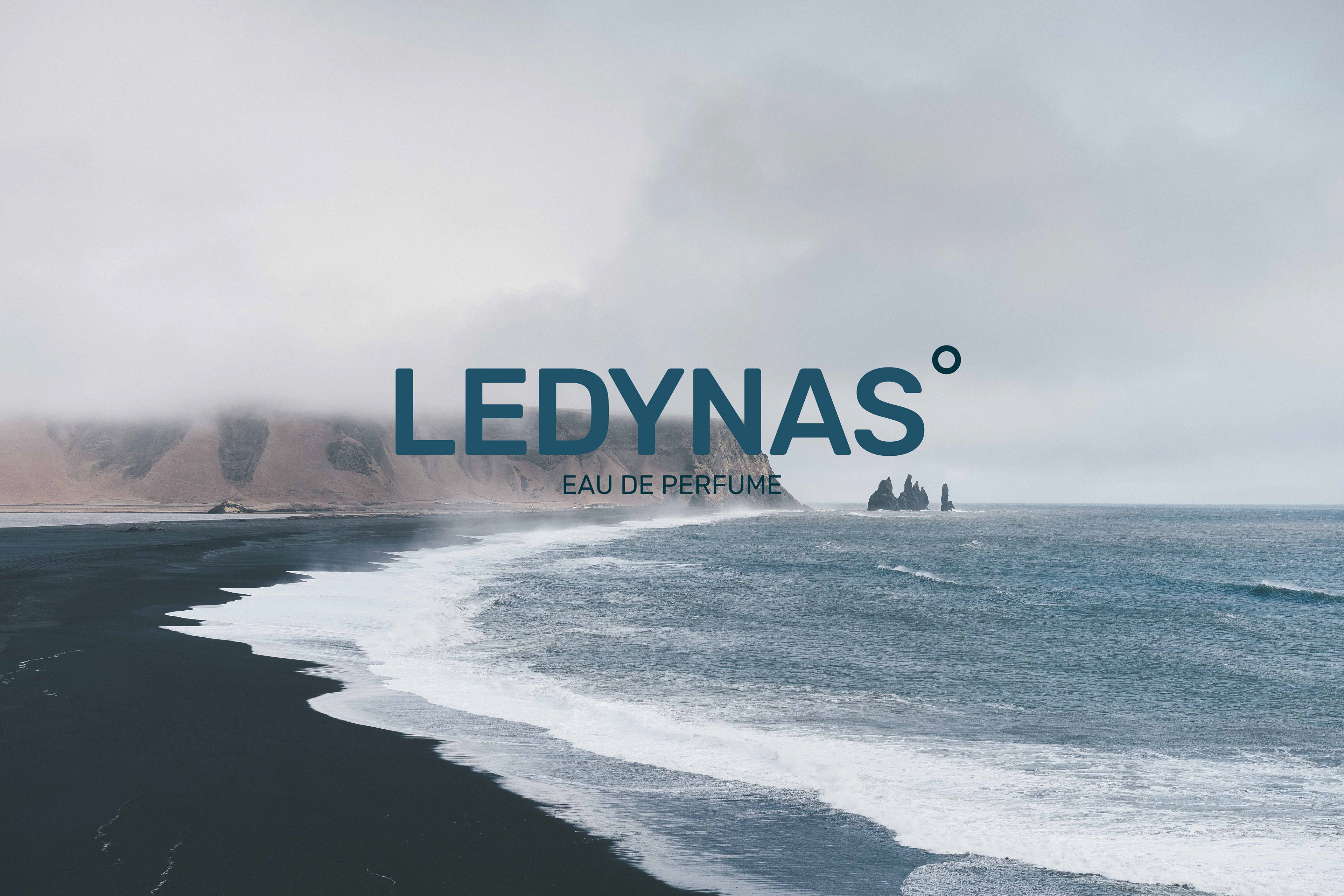
To really put across the feelings from a concept you need to have a strong range of images that conclude and support your design concept. I chose these because I think they really fit into the concept and bring in the right atmosphere.